

Krypton Media Kit
Everything here is yours to use when you write about Krypton or build something that mentions us: the logo, the colours, the typography, and where the mark came from. Clearspace, minimum sizes and the things not to do are further down the page.
Our Brand
Key organisational elements
The Krypton brand is built on precision, global reach, and the convergence of AI with finance. Every element, from the K-mark to our teal palette, is engineered to convey trust and velocity.

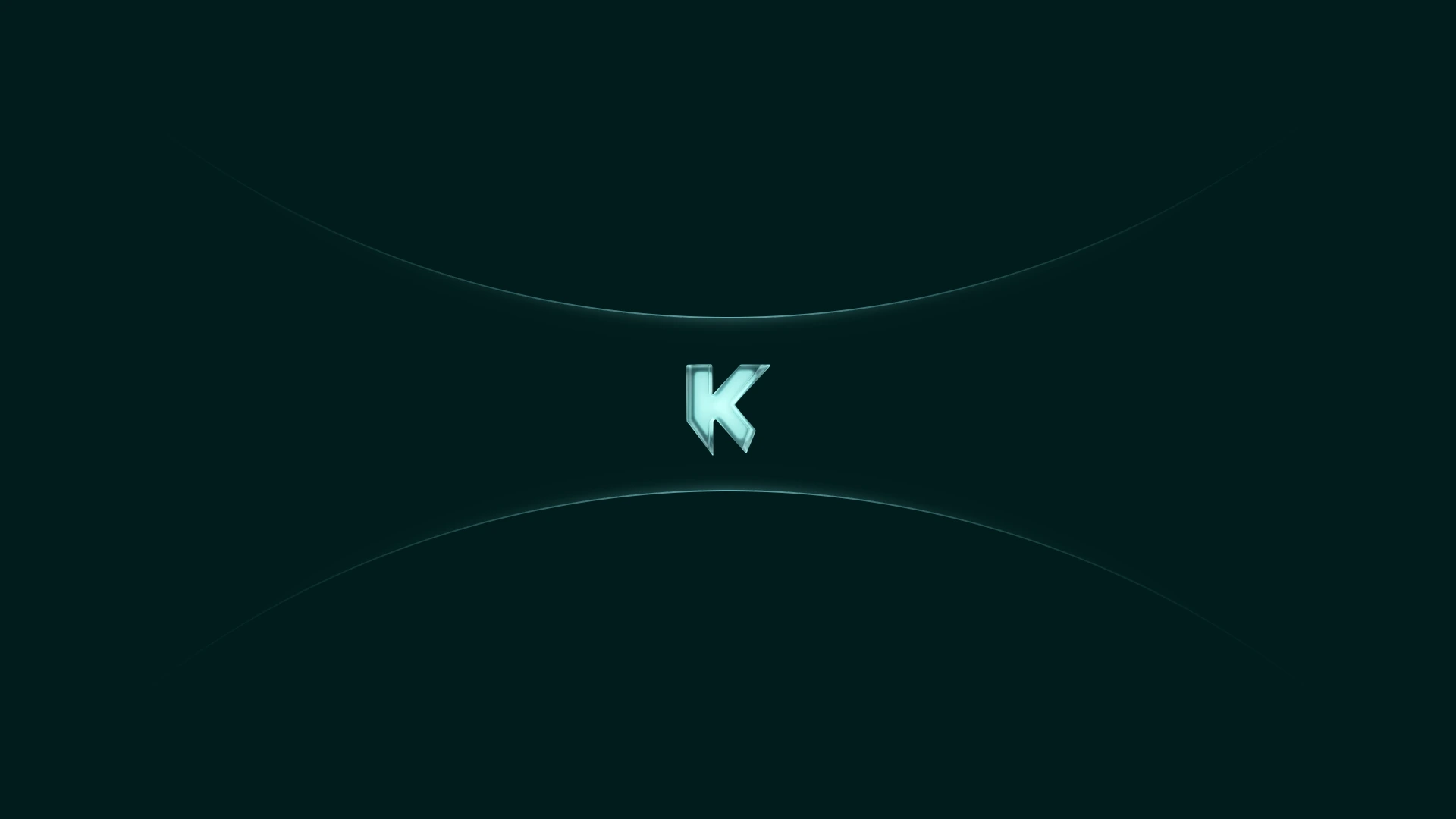
The K-Symbol concept
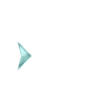
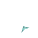
The mark is a K cut like a crystal, named after krypton: a noble gas that stays stable and will not react with what surrounds it. The angles carry the precision. Teal is the charge.
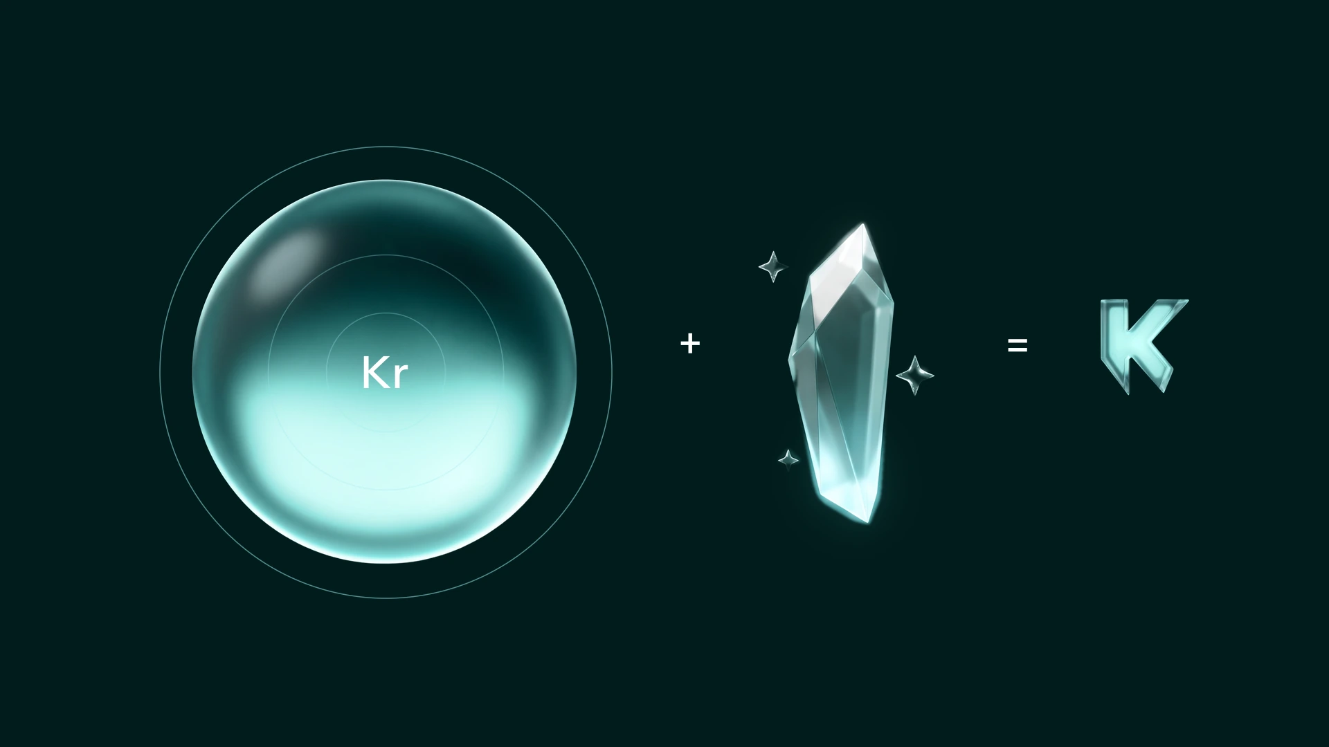
The way we work
Excellence is embedded in the infrastructure, not performed on the surface. Krypton's brand voice is the quiet confidence of a system built to solve the problem before the user has to ask.
Logo
Overview
The Krypton logotype is our most recognisable brand element. Applied consistently across every touchpoint, it signals precision, financial trust, and global capability.
Horizontal Logo
The horizontal lockup is the primary and default choice for most use cases, from web headers to document footers.
Vertical Logo
Use the vertical lockup when horizontal space is constrained: app icons, square formats, profile pictures.
3D Logo
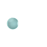
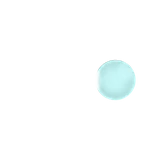
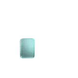
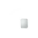
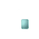
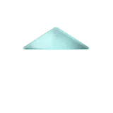
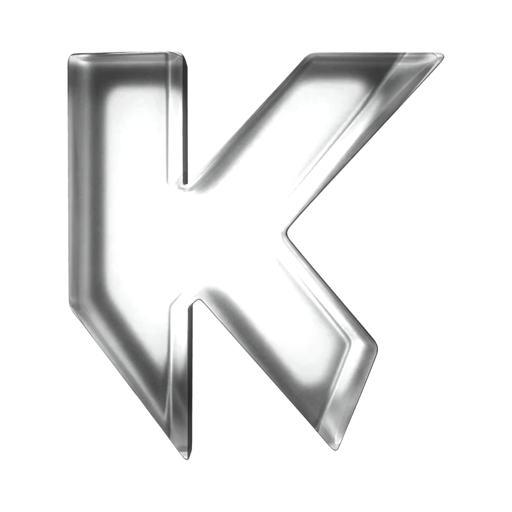
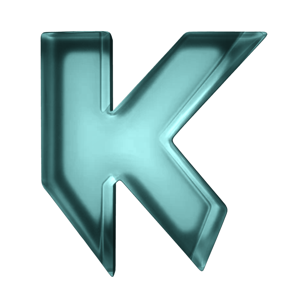
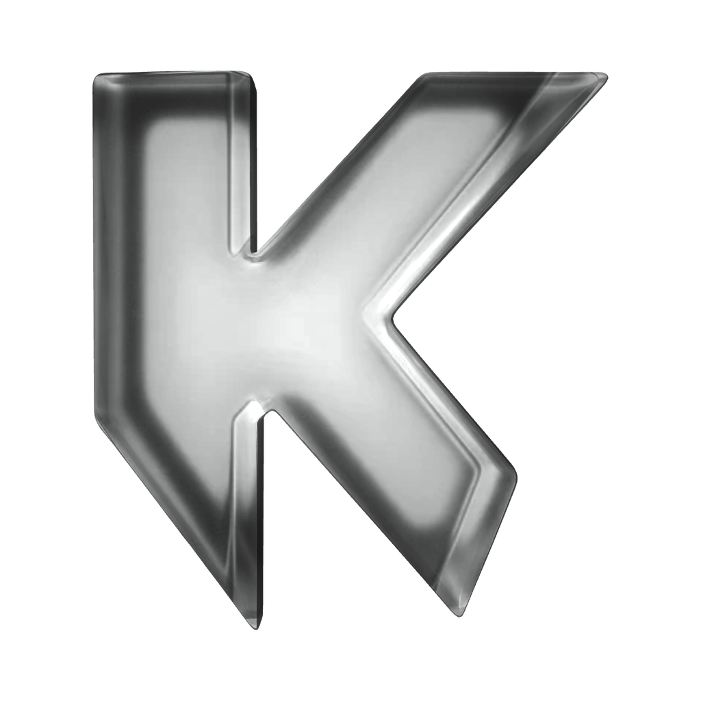
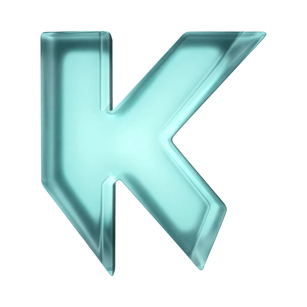
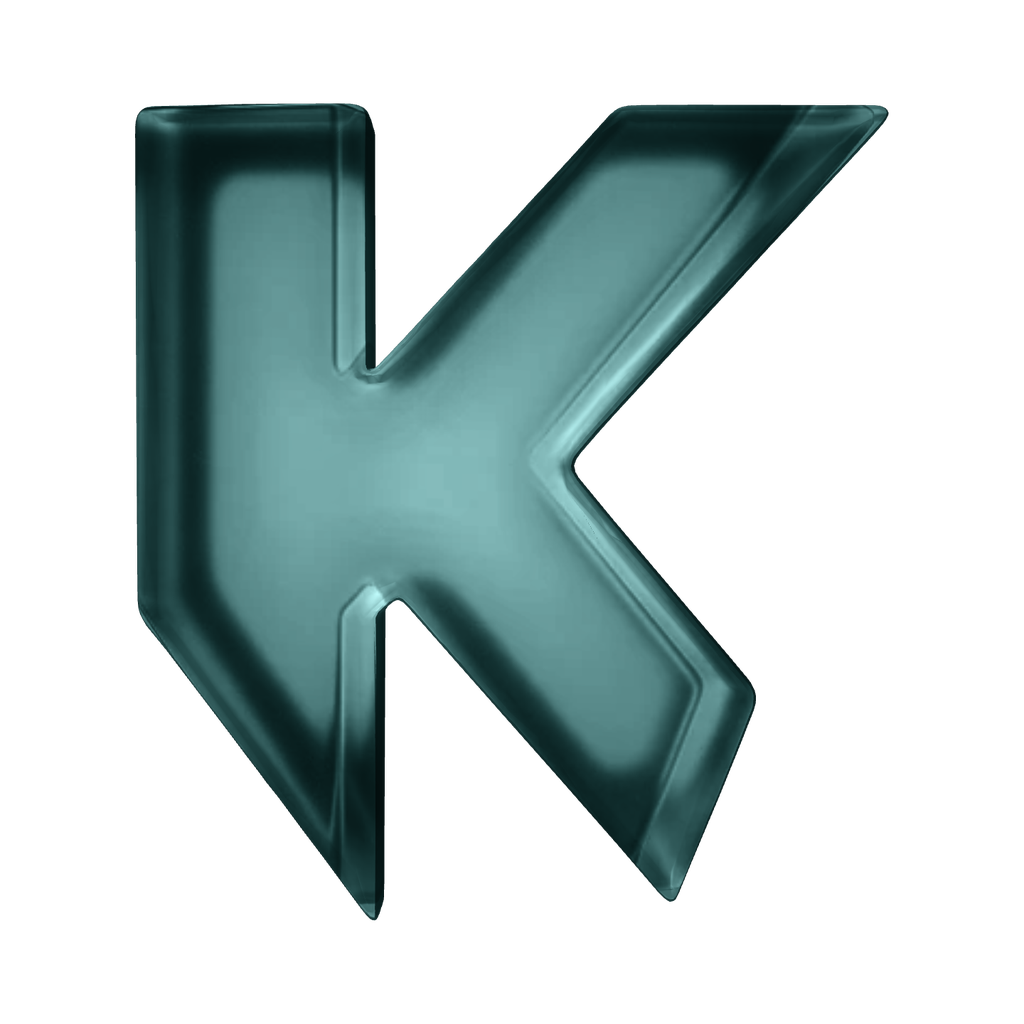
The K in glass, as it stands in the header and rises in the footer: square to the reader at rest. Five tints of the same glass, all within the palette — tints, not new materials; clear teal is the default. The 3D K is Krypton's own mark on its own surfaces. For partners, print and anything small, use the flat logo.
Clearspace
Scalability
The logo scales as one piece: the K and the name keep their proportion at every size. The minimum height is 16px for the flat logo and 24px for the 3D K; below that the glass stops reading as glass, so use the flat K.
Logo Misuse
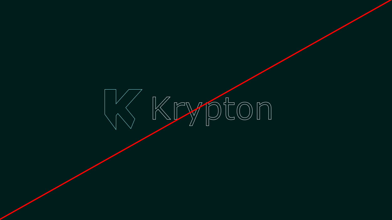
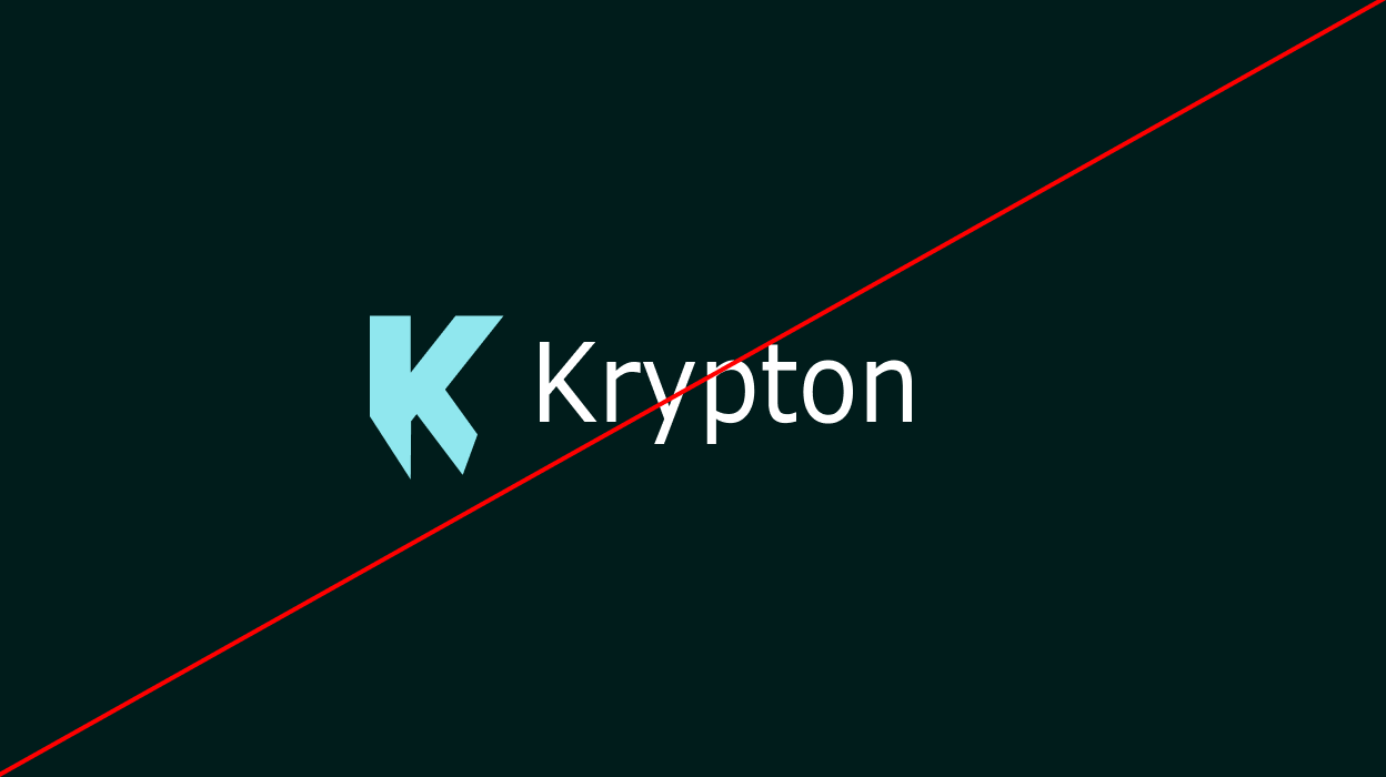
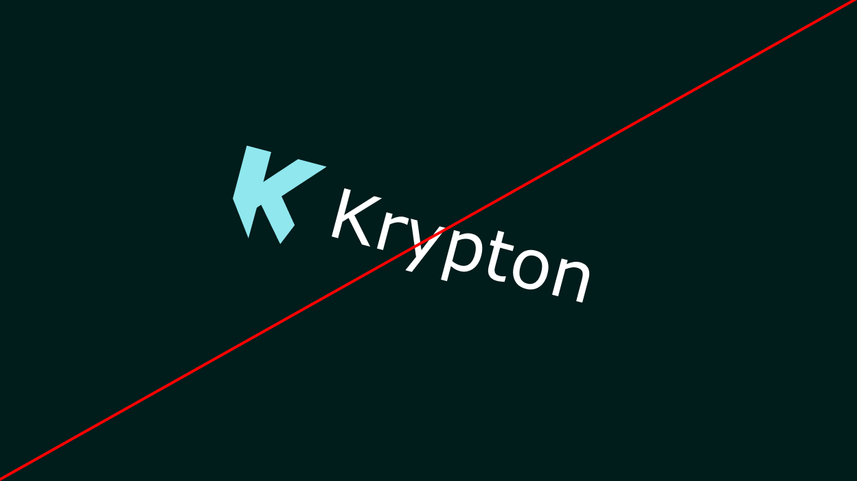
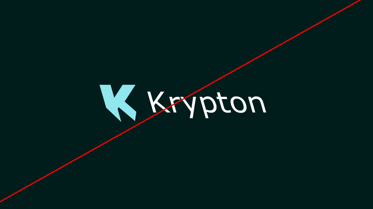
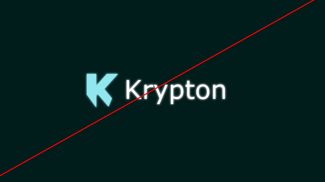
The Krypton logo should never be altered, distorted, or reinterpreted, flat or in glass. Below are the most common mistakes to avoid; the last four are the 3D K's.
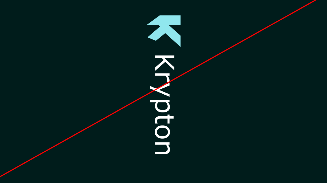

Logo Clarity
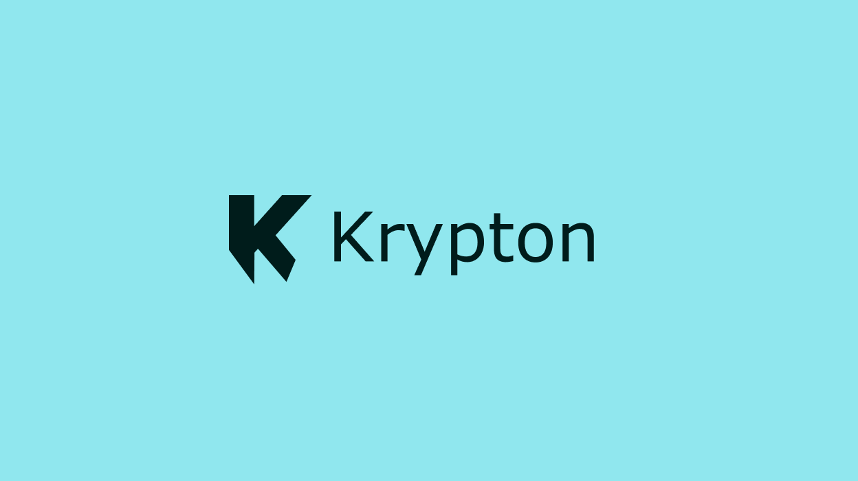
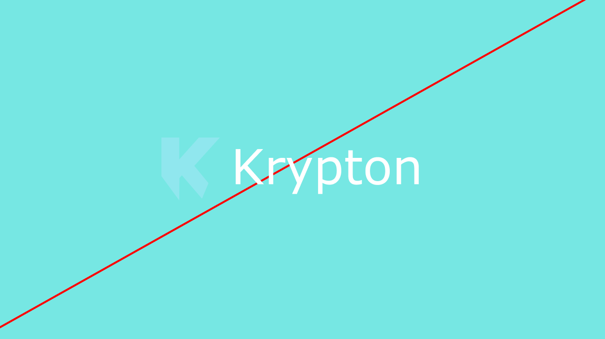
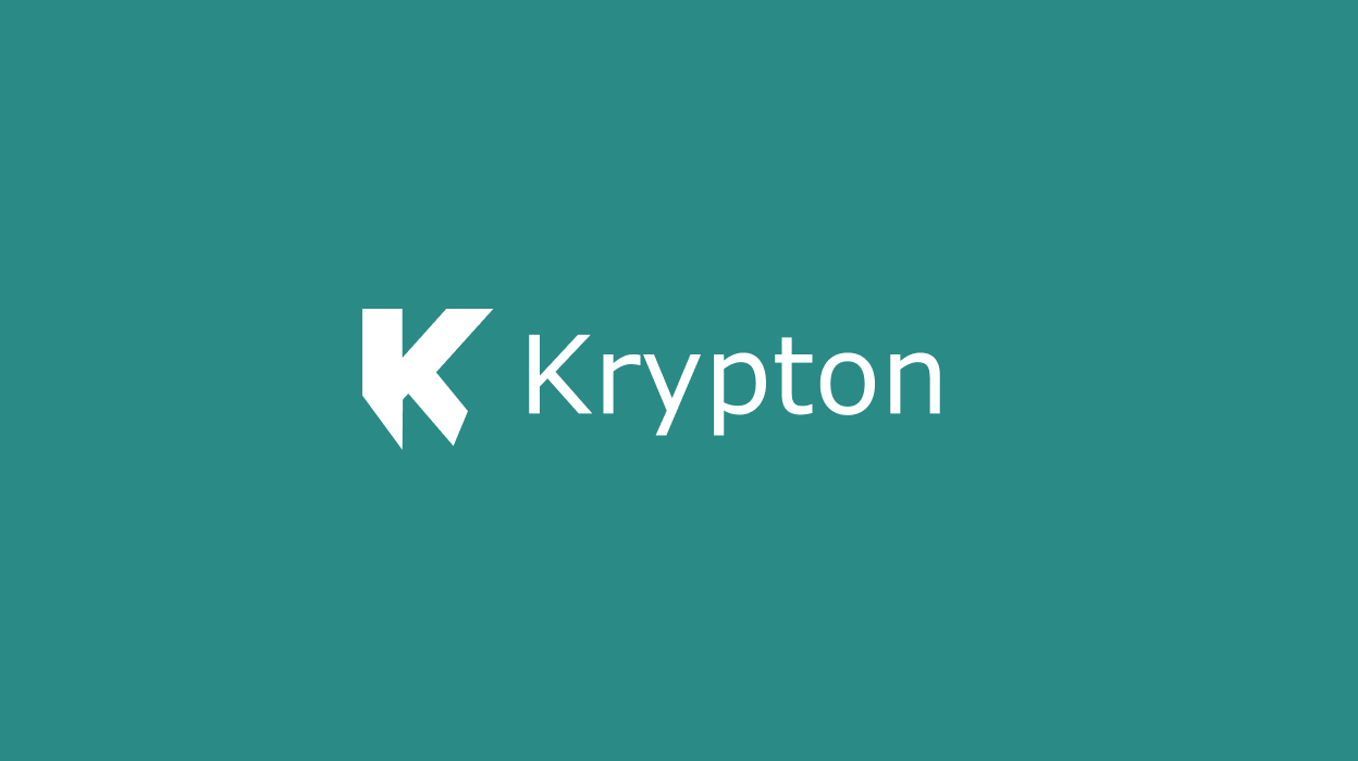
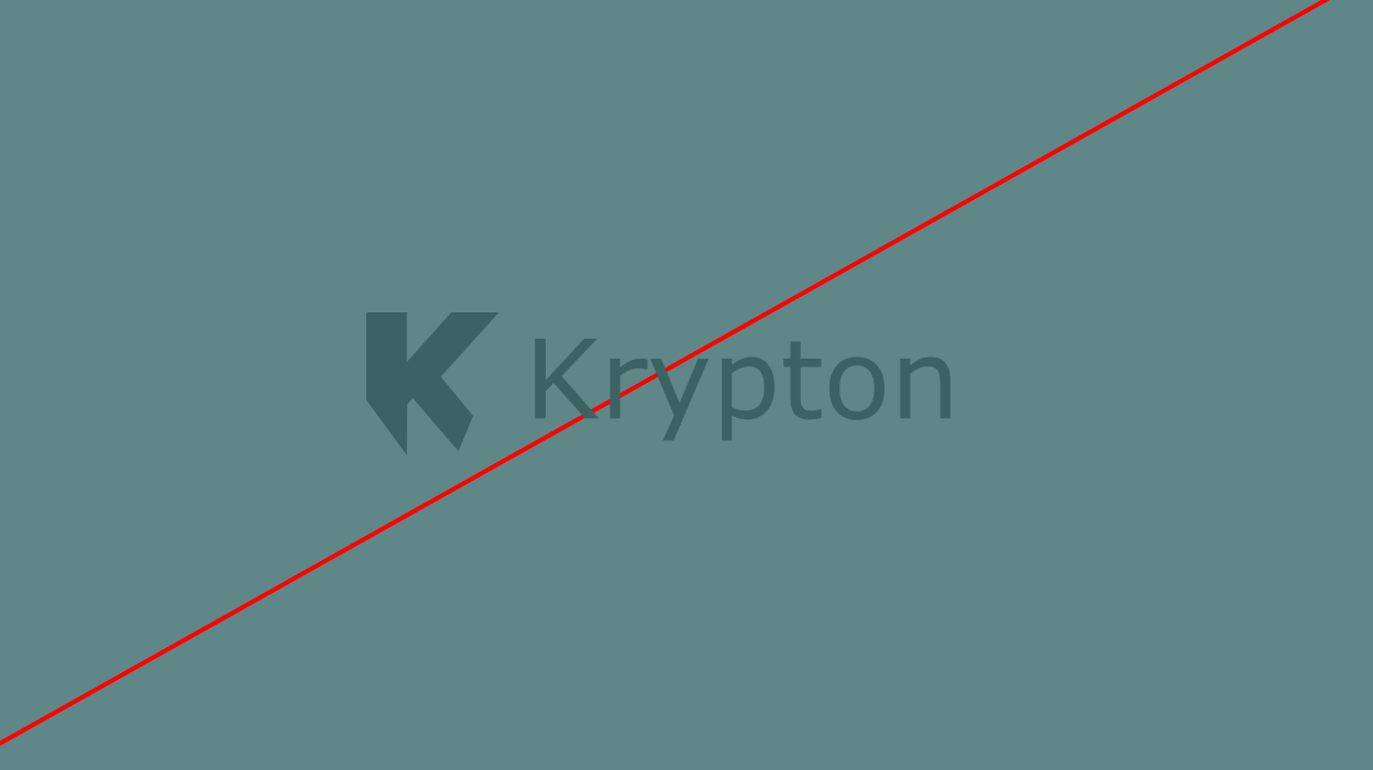
Ensure maximum contrast between the logo and its background. Use the positive (white/light) version on dark backgrounds, and the dark version on light backgrounds. The 3D K needs a dark, quiet ground: glass takes its colour from what is behind it.
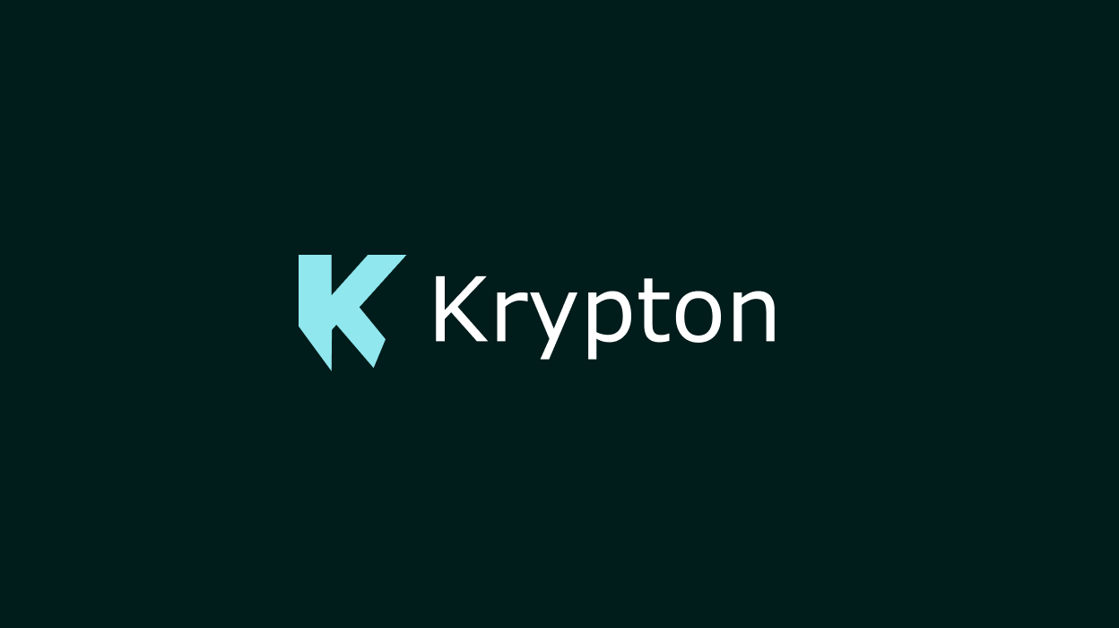
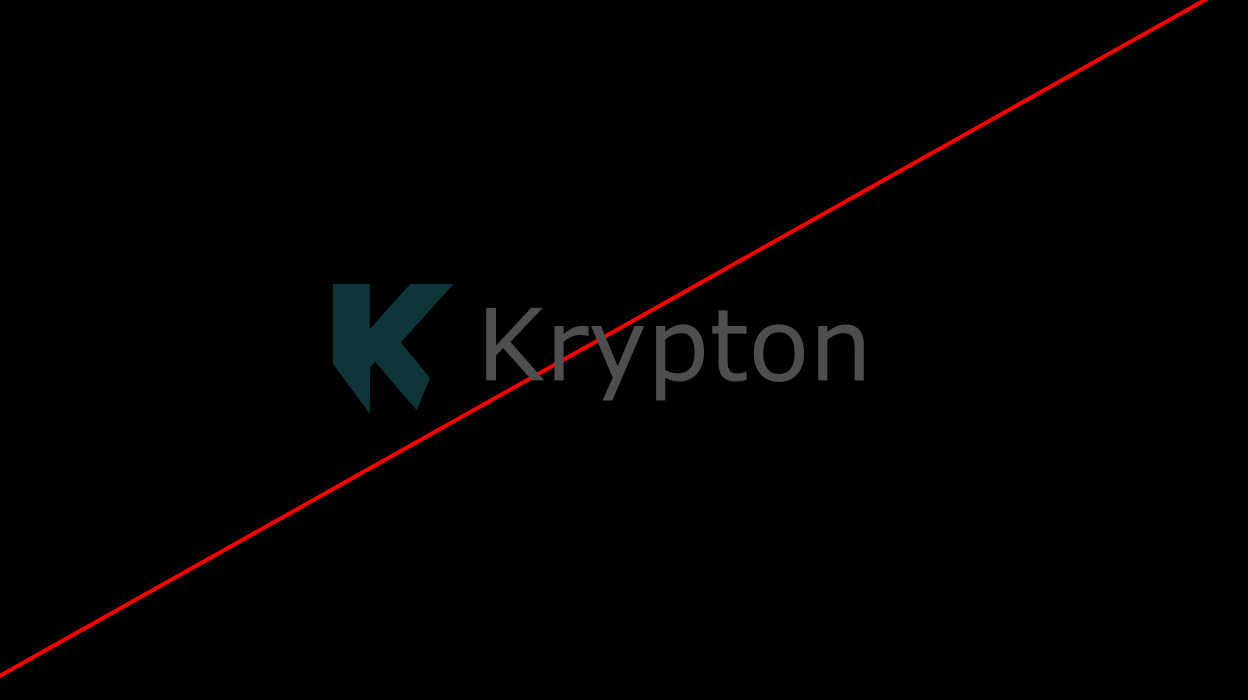
Co-Branding
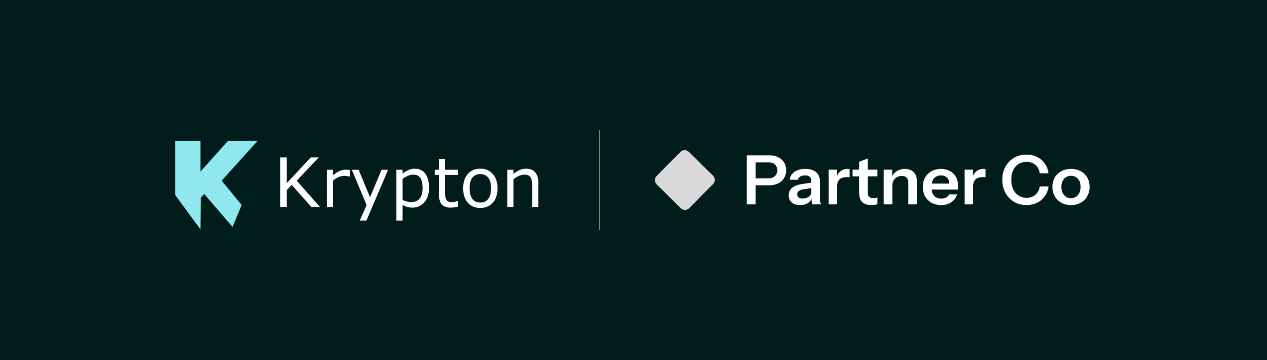
Pair the flat Krypton lockup with a partner's logo, balanced in visual weight and separated by a thin vertical rule with clear space on each side, as shown. Use a co-branded lockup only once a partnership is agreed in writing, and never to suggest a licence, a banking partner or an endorsement. The 3D K stays on Krypton's own surfaces and does not appear in a co-branded lockup.
Typography
Core Typeface
The main font of our brand is the Instrument Sans group of fonts. Straight-forward with a polished simplicity, our typography gives all the key information but never talks over the main content.
- Main Typeface
- InstrumentSans
- Uppercase
- ABCDEFGHIJKLMNOPQRSTUVWXYZ
- Lowercase
- abcdefghijklmnopqrstuvwxyz
- Numerals
- 1234567890
- Punctuation
- (¡¿!?.:,;…)[&@#]{-–—|¦·}‹›«»‘’“”‚„•/\
- Numerators, Denominators
- 1234567890 1234567890
- Symbols
- &%‰©℗®™°§¶*†‡#№
- Arrows
- ←→↑↓
- Fractions
- ¼½¾⅓⅔⅛⅜⅝⅞
Weight
Instrument Sans with five weights that range from light to Bold. Use Light or Regular for body, Medium for labels and subheadings, Semi Bold for secondary headlines, and Bold for primary headlines and hero text.
- Body Copy, Subheaders
- Regular
- Headlines, Short Paragraphs, Subheaders
- Medium
- Headlines, Accents
- Bold
Setting Type
Typography should only ever be aligned left or centred. Never right-align or force-justify. Left alignment is preferred for most digital contexts; centred is reserved for hero sections and large display text.
Type Hierarchy
No more than three type sizes in one composition. Each size should be at least 50% larger than the previous. This creates clear visual structure without overwhelm.
In some instances, it might be necessary to break this rule and have two type sizes that are closer together. In this case, a minimum 35% size difference should be followed.
Colors
Core Palette
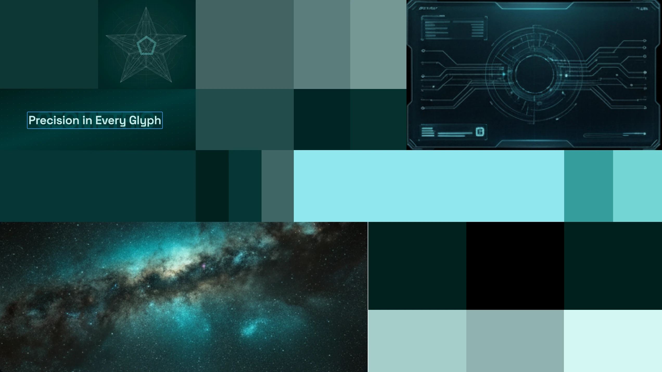
The Krypton colour palette balances the precision of finance with the energy of next-generation infrastructure. Deep Space anchors authority; teal signals forward motion; surface bright follows our product suite.
Primary Colors
- TealCMYK: 37, 2, 0, 7
- Deep SpaceCMYK: 100, 0, 6, 89
- Surface BrightCMYK: 43, 0, 1, 76
Secondary Colors
Neutral Colors
3D Assets
One glass, four materials
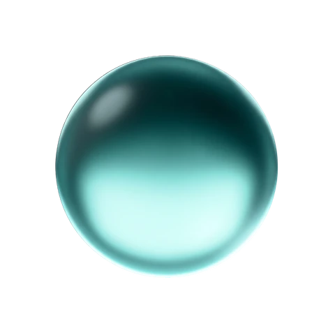
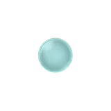
Every object and icon on the site is glass, lit from above: a white highlight on the upper edge, a caustic pooling below. Structure — lines, grids, text — stays flat. There are four materials and never a fifth.
Clear teal
Krypton's own objects: the things that hold and move value.
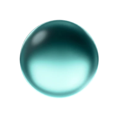
Orb 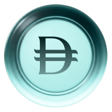
AED 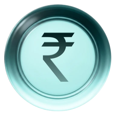
INR 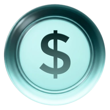
USD 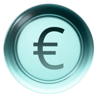
EUR 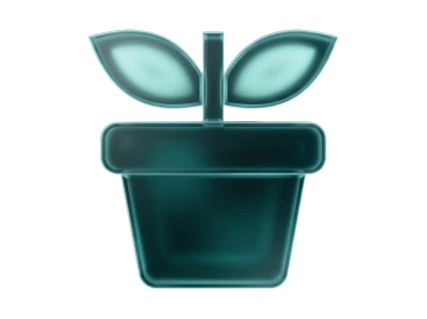
Plant 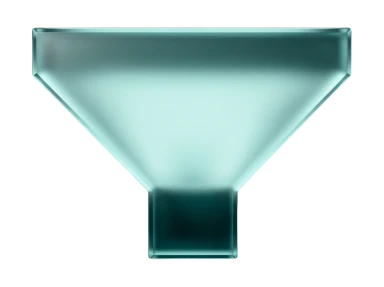
Funnel 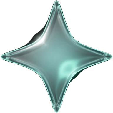
Sparkle 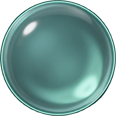
Step bead 
Tile
Frosted pale
Interface-scale icons: figures and features.
24 hours 
Seconds 
Clock 
Coin 
Database 
Ether 
Globe 
Lightning 
Returns 
Flash 
MCP 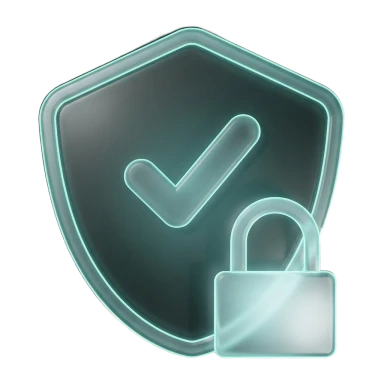
Shield
Smoked
Dark glass with a mint mark: an object that sits back — planned, at rest.
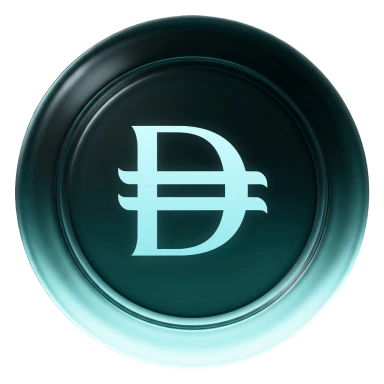
AED 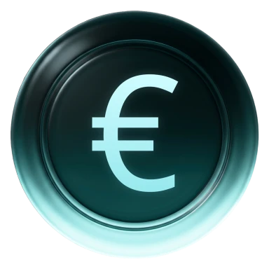
EUR 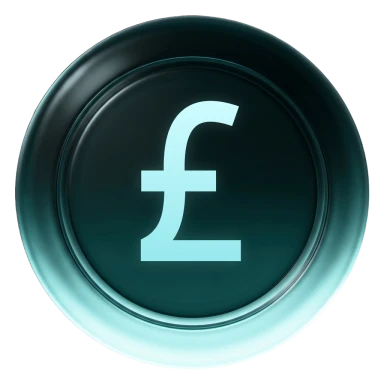
GBP 
INR 
USD 
Lens 
Gauge 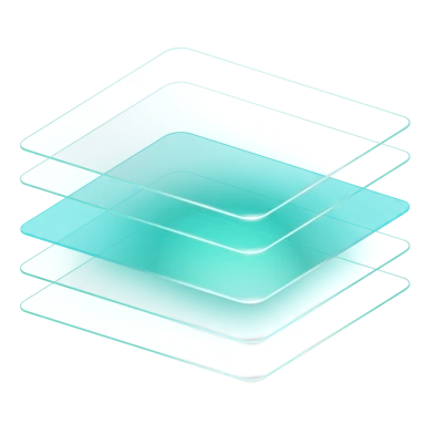
Layers 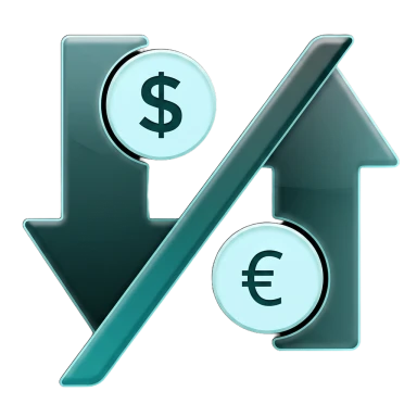
Swap 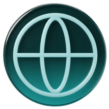
Globe
Neutral
The smoked glass greyed: the legacy route, and a mark at rest.
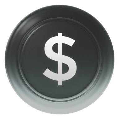
USD 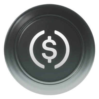
USDC 
Coin 
Card 
Hourglass 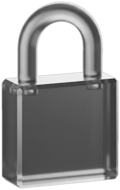
Padlock 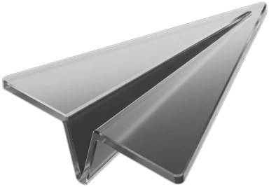
Plane 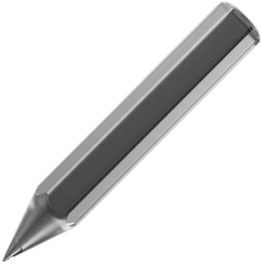
Pencil 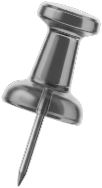
Pushpin 
Magnifier
Three states
An interface icon rests grey, lights teal when it acts, and turns white on a lit fill. The change is a crossfade — never a glint or a light sweeping across it.
| Rest |  |  |  |  |  |  |  |  |
|---|---|---|---|---|---|---|---|---|
| Lit |  |  |  |  |  |  |  |  |
| On a lit fill |  |  |  |  |  |  |  |  |